Life is complicated enough already. When older adults and their families visit your senior living community’s website, they’re not looking to get lost in a confusing labyrinth of pages, menus, and tabs. Keep the interaction simple, and keep it moving with clear, logical calls to action.
Let’s explore six ways to simplify the user experience for visitors to your senior living community’s website:
1. Efficient Use of Time
Your website should be easy to navigate so visitors can quickly find the information they need. Use clear, concise headings. Organize your content logically so that users can find what they’re looking for without having to click around for it.
Load time matters too. Slow load times are frustrating for visitors and can lead to higher bounce rates. Improve your website’s performance by compressing images, minimizing code, and using caching to reduce load times.
2. Have a Defined and Clear Focus
Make sure your website has a clean, uncluttered layout with content that is focused on the topic. Avoid using too many images, videos, or other elements that can slow down loading times or distract users from the information they’re looking for.
3. Collect Prospect Data to Drive Lead Generation
Use forms like Waypoint’s Lifestyle Quiz to collect data about your prospects’ preferences and needs. Your face-to-face meetings and in-person tours with older adults and their families will go much more smoothly with the right relevant background information to provide context for your sales team.
4. Meet Consumers Where They Are
Visitors to your senior living community’s website are likely looking for specific information, such as services, pricing, and amenities. Make sure this information is prominent and easy to find on your website.
Also, consider the technology your visitors may be using. Many people access the internet on their smartphones or tablets. Make sure that your website is optimized for mobile devices. Responsive design will see to it that your website looks good and functions well on screens of all sizes.
5. Simplify Pricing Talk Track
Use concise and clear language to describe the costs associated with your senior living community. Avoid technical jargon or complex pricing structures. Use bullet points or tables to organize information and make it easy to understand at a glance. Provide contact information so prospects can have their questions answered by a sales rep.
6. Create PULL not PUSH
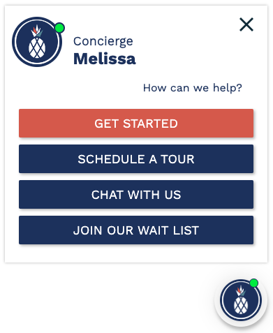
Use clear, compelling calls to action throughout your website to encourage visitors to take specific actions, such as scheduling a tour, contacting you for more information, or subscribing to your newsletter.
Try Waypoint’s Navigator for Free!
If your senior living community’s website could benefit from a tool that simplifies engagement for visitors, meets them where they are in their journey, and converts inquiries into tours with customized calls-to-action, Waypoint’s Navigator virtual sales assistant is standing by.

